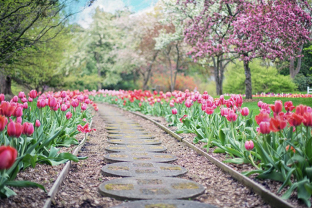
Ever wondered how to make your landscape more appealing? By following the below 7 principles you will turn your landscape into a work of art!
No matter what you think about design, it is literally everywhere. Your clothes, cell phone, wallpapers, and even a brush for your cat include the basic principles of design. Like it or not, you use some fundamental elements of design even when you write a college essay (yes, it also relates to coming up with a special design pattern).
Apart from providing value in terms of sense and cohesion, you have to comply with the standards of formatting as well. If this instills fear in you or makes you cringe in disgust, you can buy an essay online and get a flawless college portfolio.
Anyway, there are a lot of areas where you can apply your talent for arranging elements and please the eye of the beholder. In fact, it can be creating handmade things, such as a DIY Christmas card, or even drawing pictures. And if you exercise a professional approach, you will also apply similar principles to whatever is being designed.
Let’s take a closer look at some of the most essential rules of landscape design – an area where you can make your wildest dreams come true.
1. Unity
Everything about your project should give people observing it a feeling of unity. In other words, it should create harmony everywhere around you. All the elements of your landscape, such as trees, bushes, or grass, are supposed to complement one another and create one theme.
There are a couple of ways in which you can achieve the unity of your landscape. Arranging plants by their shape is a good way to come up with a good picture. The trees, surrounding your lawn and the bushes growing beside your fence should all be uniformly shaped. Do not choose plants of different shapes – that only makes sense if you need to achieve a repetitive pattern.
Repetition is another way to achieve unity within your design. It deserves your attention as the abundance of the same objects, even if they are of the same shape, makes your landscape look dull and sometimes boring. Try to achieve some diversity by arranging all the objects in a repetitive way. The patterns can be different: big-small-big, square-round-square, short-high-short-high, etc.
A good way to introduce diversity without affecting unity is to use alternating texture patterns. It isn’t as striking as alternating shapes and can significantly relieve the monotony.
2. Balance
Balance is basically the equality of visual attractiveness. It is subdivided into formal (symmetrical) and informal (asymmetrical) balance. The former presupposes that one side of a landscape is smaller/bigger than the opposite one. Symmetrical balance, on the other hand, uses geometrical figures and requires constant maintenance to keep its formal look.
Asymmetrical balance is less formal and allows more freedom. It varies from side to side, making it possible to place objects in a more chaotic way. These two principles of balance have been used by landscape designers since ancient times. They are also proving their usefulness in today’s environment. By following the rules of balance, you can create a real landscape masterpiece.
3. Simplicity
This one is pretty obvious. Try to avoid using too many details and colors. The idea is pretty simple – everything should look attractive and not overloaded with details. That said, a landscape shouldn’t look too monotonous and boring. Just don’t confuse the use of simple patterns and applying simplistic ideas. There are a lot of complex patterns that combine water, lighting, and various decor within simple unity.
4. Proportion
It’s about the proportion of objects your landscape is made up of. Different people, children, and adults perceive the same objects in a different way. That is why the buildings, space, plants, elements of decor, and other elements of your landscape should be proportionately sized. It will further contribute to the unity mentioned above.
5. Focalization
Being one of the most important design principles, it is the first thing that attracts the viewer’s attention. The focal point is the most powerful feature of the landscape. There can be several points of focalization in different areas of a landscape. However, you should not overuse this principle. First of all, it aims to attract the viewer’s attention. Hence, the excessive use of focalization may cause the exact opposite effect. Some of the common features that draw people’s attention include bright colors, sophisticated or unusual shapes, statues, etc.
6. Rhythm
You can add rhythm to your landscape by setting some of its elements at an equal distance. This can be a row of trees or light posts placed at the same interval from one another. Keep in mind that other objects like benches, stones, bushes, and sidewalks should be arranged in a similar fashion. Creating lines like this complements the landscape and makes it more interconnected and well-organized.
7. Contrast
Contrast lets you make your landscape look strikingly fresh and appealing. Arrange colors in an alternating way and you will notice a significant change in the way your scenery looks. Remember, though, that warm colors, such as red or orange, stand out and as such make an object appear closer to you. Cold colors, on the other hand, create a perspective and make objects look more distant.

